

Advanced Guide: Refining Your ICP For Scaling Outbound
A 3-step process + 2 AI Prompts

Read time: 13 min
Welcome to a new 🔒 subscriber-only edition 🔒 of my weekly newsletter of Outbound Kitchen. Each week I dive into reader questions about scaling outbound and making it your #1 growth engine. For more: Live Outbound Classes | Podcast
3 months ago I wrote the first guide: The Proven Guide to Building Your Ideal Customer Profile (ICP)
Today we're going to take it up a notch. I want to go deeper, into the specific data points you need to nail your ICP, especially if you're scaling outbound.
What you will get:
I'm gonna show you exactly how to find the data, where it’s hiding, and the best ways to pull it out. You'll even get some AI prompts that will lead you straight to the public sources of data you need.
Here’s the thing:
Most companies just scratch the surface with 1 or 2 data points (revenue or headcount), thinking that's enough. But that’s why they get stuck:
They end up chasing after 36,000 accounts when in reality, only about 3,000 actually matter.
They waste resources going after accounts that aren’t even valuable or churn quickly.
Costs explode because they're spending money chasing the wrong leads.
Sound familiar? Not great, right?

But there's a better way:
Beginner: 1-2 data points. (Most companies stop here and wonder why it’s not working.)
Advanced: 10-20 data points. (You're getting warmer.)
Expert Level (Snowflake): 140+ data points. (Now we're talking.)
With these data points, you can build two critical scores:
Account Propensity Scoring (APS): evaluates how well a prospect fits with Snowflake's solutions by comparing similarities to their current customer base14. This score helps identify which accounts are most likely to convert based on characteristics they share with existing successful customers.
LTV: predicts the potential spend of an account over the next 36 months based on patterns observed in similar accounts. This focuses on the revenue potential rather than just conversion likelihood.

Why bother with 2 scores?
Because if you rely only on quick conversions (APS), you'll miss out on those juicy, long-term accounts (LTV). Balancing these two helps you:
Nail down predictable revenue.
Boost customer retention.
Cut the guesswork from your outbound strategy.
This approach also keeps everyone on your team aligned, stops reps from fighting over the best accounts, and gives you rock-solid data for territory plans, forecasting, hiring, and growth plans.
It’s exactly what you need to scale your outbound engine, without burning your resources chasing the wrong deals.
What's on today's menu:
Step 1: Clearly Understand the Problem You Actually Solve
Gather customer data
Pain Point Quantification Framework
Step 2: Finding Digital Breadcrumbs of Your Target Accounts
Example for Castordoc (for data teams)
Example for 5 other companies
Step 3: How to Use AI to Refine Your ICP (Fast)
Advanced Guide: Refining Your ICP For Scaling Outbound
Step 1: Clearly Understand the Problem You Actually Solve
Before you start chasing companies, slow down and ask yourself a simple question: What exact problems does your product solve, and who exactly has those problems
Most companies skip this step and trust their marketing materials way too much. But marketing is just talk, what you need is real, concrete data from your customers.
Gather data from these 3 important places:
Your Website: Check how your company talks about itself. What problems do they highlight most? What features get the spotlight?
Testimonials & Case Studies: This is gold. Customers tell you exactly how your product made their lives better. Look closely at the specific results they mention, and note what types of companies achieved them.

Third-party reviews (G2, TrustRadius): These places have no filter, so you get honest feedback. Often, customers talk about surprising ways they use your product, stuff you might never have thought of.

Real Example (Castordoc):
Let’s look at how I did this when I was at Castordoc. I sold to data and analytics teams at e-commerce, fintech, and SaaS companies. Not a lot of public info about these teams online, right? Wrong! There’s plenty if you know where to look.
You can do this research manually, or save time using the AI prompts I share (check them out in the paid version with a free 7-day trial).

Pain Point Quantification (aka "Ranking the Problems"):
Next step, you need to organize and prioritize the problems your product solves.
Once you've collected the problems your customers face, here’s how you prioritize them:
List all problems clearly: Go through your sources and make a simple list.
Give each problem a score based on:
How much money it saves or makes
How much time it saves
How much risk it reduces
How much stress or hassle it removes
Rank these problems: Combine how often each issue shows up (especially on review sites like G2) with how big of an impact it makes.
Real Example (Castordoc):
When we did this at Castordoc, we discovered exactly which issues our customers cared about most. Knowing this allowed us to focus on the right customers, saving tons of time and improving results.

Step 2: Finding Digital Breadcrumbs of Your Target Accounts
Alright, now that you're clear about the problem you solve, it's time to figure out how to spot companies that actually have this problem.
Here’s the thing: even if the industry seems "old-school" or not very digital, you can still find tons of useful info online.
But, be careful with your data source accuracy. For example, at Chili Piper we once used Oracle’s tool to see who had Salesforce. Half the time, it was wrong. So always double-check.
Here's where you can find useful data:
Company Databases: Crunchbase, LinkedIn, ZoomInfo, Apollo, etc.
Review Sites:
Sofware: G2, Capterra, TrustRadius,
Restaurants: Google Maps, TripAdvisor,
Job Postings:
Indeed, LinkedIn Jobs (indicators of tech adoption, departmental growth).
For a company I worked recently, we were using an AI agent to find the career page, and find other job boards
Technographic Data (used on websites): BuiltWith, Wappalyzer (technology stacks, integration potential).
Company Websites: Product pages, blogs, partner pages.
Social Media: Twitter, LinkedIn, Reddit, specialized forums.
Press Releases & News: Funding, expansions, acquisitions.
Industry websites:
Repvue: Check company quota attainment, tech stack, sales team structure, salaries, and how they perform compared to their industry.
Glassdoor: Get insights into HR, interview process, benefits, and employee reviews.
Data you can use in your scoring:
Industry niches and sub-industries
Tech stack (what tools do they use?)
Number and growth of end-users
Website traffic and marketing presence
Integration possibilities (do they integrate easily?)
Office locations, number of offices
How innovative are they (early adopters?)
Sales approach (enterprise vs SMB, sales-led vs product-led)
Specific job titles on their team
Customer reviews and online reputation
Physical details (roof size, square footage)
Revenue trends (growing or shrinking?)
Funding stage (Seed, Series A/B/C, IPO)
Tech spending and ad spending
Social media activity
Real Example (Castordoc):
When I joined Castordoc, they had 36k target accounts, way too many. Most weren't even a good fit because they still used old-school on-prem solutions. We had to go deeper:
First, we only picked companies already using cloud data warehouses. Still too broad.
Then, we narrowed further to companies with a modern data stack (Snowflake, dbt, Databricks, Airflow). This cut the list to just 3k, but every one of these was a great fit.
Here's a basic version of how you can capture the data and score it:
Technical Indicators:
1. Complex Data Stack
Relevance: Companies using many databases, data lakes, warehouses have big data management problems. They definitely need a data catalog.
Sources: Job postings (TheirStack, Sumble), interviews, Modern Data Stack site.
Transformation: Categorize technologies by type (warehouse, lake, BI), count distinct systems
Weight: 9/10 - Strong predictor of catalog need and LTV
2. Modern Data Stack Adoption
Relevance:
Companies using Snowflake, BigQuery, Airflow clearly care about data governance.
Employee titles: job titles like "Analytics Engineer", it's a sign they're modernizing.
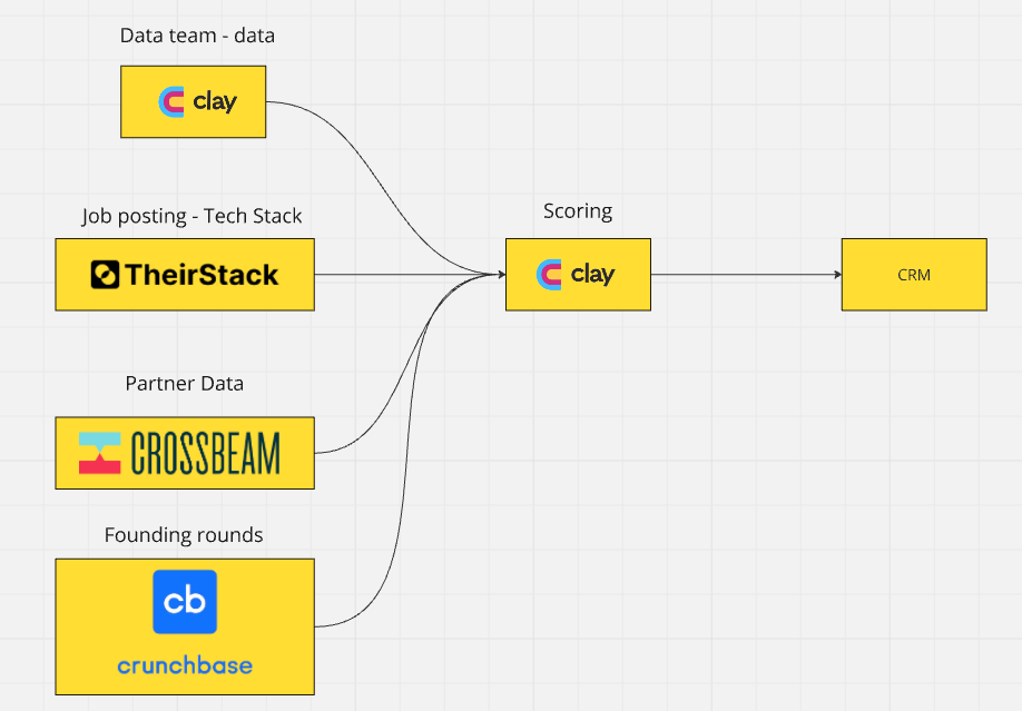
Sources: Job postings (Sumble or TheirStack), G2/TrustRadius reviews, modern data stack Website, interviews, job descriptions of employees, and partner Data: Tools like Crossbeam or Reveal are gold for account mapping and identifying shared tech stacks.

Extraction: Sumble API, or TheirStack API → Clay or your CRM or Data warehouse
Transformation: Calculate "modernity score" for each technology
Weight: 8/10 - Direct indicator of data catalog compatibility and need
3. Multiple BI Tools:
Relevance: Companies using 3+ BI tools (Looker, Tableau, Power BI) have big issues with data silos and documentation.
Sources: Job postings (Sumble or TheirStack)
Extraction: Sumble API, or TheirStack API → Clay or your CRM or Data warehouse
Transformation: Count distinct BI tools, flag companies with 3+ tools
Weight: 7/10 - Strong indicator of documentation and lineage pain points
Business Indicators
1. Recent Funding Events
Relevance: Companies raising Series B-D usually invest heavily in data infrastructure.
Sources: Crunchbase, PitchBook, press releases
Extraction: Crunchbase API, web scraping of funding announcements (Apify to Clay for example)
Transformation: Calculate recency score, funding amount relative to industry
Weight: 8/10 - Strong predictor of budget availability and growth-driven data needs
2. Fast Data Team Growth:
Relevance: Rapidly growing data teams struggle with onboarding and documentation.
Sources: LinkedIn, Company career pages, job aggregators, press releases
Extraction:
Tracking new data employees over time: with Clay you can see how many data employees the have hired in the past 6 months
Job posting: Web scraping of career pages, tracking job posting volume over time
Transformation: Calculate 6-month growth rate, flag companies above industry average
Weight: 7/10 - Direct indicator of documentation and onboarding pain points
3. Regulatory Needs:
Relevance: Highly regulated industries (finance, healthcare) must have strong data governance.
Sources: Industry classification databases, regulatory filings, company websites
Extraction: Web scraping of compliance pages, regulatory database APIs
Transformation: Create compliance score based on industry and specific regulations
Weight: 9/10 - Strong predictor of governance needs and LTV
4. Analytics/Data Team Size
Relevance: Bigger teams = more complexity and higher potential value.
Sources: LinkedIn
Extraction: Clay can estimate the size of the data team
Transformation: Estimate team size based on LinkedIn data
Weight: 8/10 - Direct indicator of catalog need and potential LTV
Specific Industry Examples:
Financial Services Firm: Uses advanced analytics (AI/ML), multiple BI tools, recently increased regulatory requirements.
E-commerce Company: Shows multiple analytics tools (Google Analytics, Mixpanel), uses several databases, and recently expanded markets.
Other Real Examples (so you see how this works)
Okay, let's talk real examples. I want you to see clearly how different companies use data, even if the company doesn’t have a big online presence:
Solar Panels for Companies
Let's say you're selling solar panels specifically to manufacturing plants. You don't just pick random manufacturers. You target the ones who use the most electricity:
Warehouses, distribution centers, farms (especially dairy farms).
Check the roof size to estimate how many solar panels fit.
Look at their energy bills (different states have different energy costs).
Find out if the state offers help for buying solar panels (some states pay part of the cost!).
Snowflake (Data warehouse):
When I was writing the deep dive on Snowflake. Snowflake uses over 140 data points. Here’s a simple example:
If a company just bought Looker or Tableau but still uses an old-school data warehouse, that’s a big sign they're ready to move to cloud.
For healthcare companies, Snowflake checks the number of locations.
Firmographic: Yearly revenue, Employee counts, Industry, Customer count
Technographic: Cloud spend (Azure, AWS, MSFT), and total tech spend
Emplographics: Employee growth, DS (Data Science), DE (Data Engineering), BI (Business Intelligence) employee counts/growth, and DS posted jobs
Online presence: Alexa rank, and Website keywords
Trends: Year-over-year (YoY) and quarter-over-quarter (QoQ) changes in Firmographic and Technographic data

Owner.com (selling to restaurants)
Owner.com scored 500,000 restaurants, then cut it down to the top 30,000. How? They looked for signs these restaurants would spend more money long-term:
Do they use delivery apps like DoorDash or Uber Eats?
Do they have their own website with good traffic?
Are they in busy neighborhoods or streets?
Are reviews increasing month-to-month?
Because Owner.com charges a flat fee plus a percentage from online orders, these signals show restaurants that will make them more money.

Chili Piper
When I joined Chili Piper, our scoring was too basic, we just looked at industries and CRM integrations. Here’s how I would upgrade it:
CRM: Companies using Salesforce or HubSpot with B2B sales teams with SDR/AE function
Sub-segments:
Example: Vertical SaaS selling to restaurants
Sales team motion:
Sales-led, or PLG-led
selling to SMB, Mid-Market, Enterprise
Check their tech stack with BuiltWith and tech spend. (but be careful, sometimes HubSpot on a website just means marketing automation, not CRM).
If a company used Marketo, Hubspot, or Pardot, it was a clear sign they invested in their tech stack, making them a perfect fit for us.

LinkedIn: Job titles like “Salesforce Developer” or job descriptions listing the tools they use.
Job postings: Tools like TheirStack or Sumble scan job ads for tech mentions (Salesforce listed in job posts = strong sign they're using Salesforce).
We once used Oracle data to spot Salesforce users, but it was only right half the time. Always double-check.

Industry source: Check Repvue for GTM teams:


Lifetime Value (LTV) scoring
Look at how many GTM reps they have (using Clay).
Are their sales teams growing or hiring more reps recently?
Check website traffic: High traffic usually means strong inbound leads.
Do they run ads (LinkedIn, Facebook)? That tells you they invest in marketing.

Here’s a real mistake we made on the enterprise team:
We chased "enterprise" accounts just because they had 2,000 employees. But these accounts had only 20 sales reps, so deals never went beyond $30K ACV, bad fit.
We started focusing on accounts with 300+ sales reps, and suddenly deals jumped to $100K–$250K ACV or more. Those became our best-fit accounts.
Step 3: How to Use AI to Refine Your ICP (Fast)
Let’s get practical now, AI can speed things up big time when refining your ICP.
Personally, I mostly use Perplexity Pro Search when helping customers, paired with Claude 3.7 or ChatGPT 4.5 or 4o. They’re easy to use, fast, and give solid results.
Lately, I've been testing out ChatGPT's Deep Research mode with their 4o and 4.5 models. What’s cool about this one is it asks follow-up questions to make sure it really understands your prompt.
Quick note: I also tried Perplexity Deep Research, but honestly, it wasn’t great. I'd stick to the others.
AI prompt for Step 1:
🔒 Wait! Want the full guide to refining your ICP?
Here’s a quick taste:
1 AI prompt to clearly define the problem you actually solve using real customer data + the Pain Point Quantification Framework.
1 AI prompt to find the Digital Breadcrumbs of Your Target Accounts: how to extract them and use them in your scoring model.
🔓 Want the full guide?
It’s for paid subscribers only, but you can start a 7-day free trial now and get everything (including both AI prompts).
Keep reading with a 7-day free trial
Subscribe to Outbound Kitchen to keep reading this post and get 7 days of free access to the full post archives.